

We assume that you already have basic knowledge of web development (HTML, CSS, JavaScript) and you want to expand your understanding by exploring advanced topics.
Note: In this article, TypeScript will be primarily used instead of JavaScript, as it has become widely adopted in the industry.
Requesting data from the API
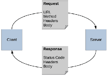
Modern applications are rarely standalone; they often rely on an API (Application Programming Interface) to fetch and send data. Whether you are building your own backend or are integrating a third-party solution, working with APIs is a basic component of modern web development.
How data is exchanged
Most modern APIs use the HTTP protocol for communication, and data is usually transferred in the form of JSON, mainly because of its lightweight structure and native compatibility. Some APIs may use XML or GraphQL queries, but these are less common today compared to REST APIs. For our purposes, JSON is enough.
Methods for creating requests
There are several ways to make an HTTP request in the browser:
- Fetch API (native)
- Built into modern browsers
- Returns a Promise and works seamlessly with async/await
- Lightweight and requires no external dependencies.
- Axios (third-party library)
- Provides a richer API than Fetch
- Supports request cancellation, automatic JSON parsing, interceptors for authentication or error handling, and is compatible with older browsers
- Useful for larger projects that require greater flexibility
Example of Fetch API
In the following example is a simple, reusable utility function using Fetch for requesting data.
async function fetchData<T>(url: string): Promise<T> {
  const response = await fetch(url, {
    headers: {
      'Content-Type': 'application/json'
    }
  });
  if (!response.ok) {
    throw new Error(`Network error: ${response.status}`);
  }
  return response.json() as Promise<T>;
}
Additional topics
- Authentication
- Many modern APIs require authentication, most often in the form of tokens (such as JWT) or OAuth.
- JWT tokens or session data are typically stored in cookies or local storage.
- Error handling
- Always handle errors — both network-related and API-specific ones.
- Use `try/catch` blocks with `async/await`, or `.catch()` with `Promise`
Tailwind CSS
Styling your application is an essential part of frontend development. Traditionally, web developers wrote plain CSS or used frameworks like Bootstrap. Today, utility-first frameworks like Tailwind CSS became extremely popular thanks to their fast and flexible approach to building user interfaces.
Instead of writing custom CSS classes for each component, Tailwind provides a wide range of predefined utility classes that you can use directly in your HTML or JSX. These classes act as low-level building blocks — for example, p-4 adds padding, bg-blue-500 sets the background color, and text-center centers the text. You can freely combine these utilities to design any interface you need, without switching context between HTML and CSS.
This approach allows for consistent styling, removes the need for large CSS files, and makes design adjustments quick and easy.
Comparing Tailwind CSS with plain CSS
In plain CSS you could write something like this:
<style>
.button {
  background-color: #3b82f6;
  color: white;
  padding: 0.5rem 1rem;
  border-radius: 0.375rem;
}
</style>
<button class="button">Klikni na mě</button>
In Tailwind, it can be written like this:
<button class="bg-blue-500 text-white px-4 py-2 rounded-md">
  Klikni na mě
</button>
Hover, Focus and state variants
You can also easily style elements based on the state they’re in, like **hover** or **focus**.
<button class="bg-green-500 hover:bg-green-600 focus:ring-2 focus:ring-green-400">
  Odeslat
</button>
Dark mode
Tailwind CSS also supports dark mode. You can use the dark: prefix, which will only apply the styles when the user has dark mode on.
<button class="bg-gray-800 text-white dark:bg-gray-700 dark:text-gray-300">
  Klikni na mě
</button>
Drawbacks of Tailwind
Although Tailwind CSS is a powerful tool, it can clutter your HTML with too many classes, making it harder to read. To partially mitigate this, you can make use of IDE extensions which hide classes. Another option is to use a framework which supports a more structured, component-based approach, such as React or Vue.js, instead of using plain HTML
Modern web design
Responsivity
When designing your application, it is important to consider the devices users will use to access your website. That’s why your application should be responsive, meaning it automatically adapts to different screen sizes. Tailwind CSS provides built-in responsive utility classes, which allow you to conditionally apply styles based on screen resolution.
For example, you can use md:bg-blue-500 to apply a blue background only for medium and larger screens.
<!-- You can also use sm:; md: or lg: -->
<div class="bg-gray-200 md:bg-blue-500 lg:bg-green-500">
  This div will have grey background on small screens, blue background on medium screens, and a green background on large screens.
</div>
Another useful tool for creating responsive layouts is CSS Grid or Flexbox, which automatically adjust to the available space. These CSS properties allow you to build complex layouts without relying on hard-coded width or height.
Tipy
- Use relative length units like
em,rem, or percents, instead of fixed pixel values - Test your layout on various devices and screen sizes
- Developer tools in browsers like Chrome or Firefox allow you to simulate devices, including phone
- Consider adopting a mobile-first approach — start by designing for small screens, and then gradually enhance the layout for large ones
Figma
Figma is a widely used design tool for prototyping layouts and user interfaces for web applications. It enables rapid creation of prototypes and seamless collaboration — all without writing a single line of code. This makes it easy for non-programmers and designers alike to contribute to the design process.
Brand manual
A brand manual is a collection of rules and guidelines which define how the brand should be represented visually and verbally. It serves as a foundation for frontend developers, consistent and professional-looking UI.
It typically includes:
- Colors: Primary, secondary, and accent colors with clear usage guideline
- Typography: Fonts, font sizes, and the hierarchy of headings, paragraphs, and UI elements
- Logos and icons: Approved logo version, minimum spacing requirements, and a defined icon set
- Components: Standardized buttons, forms, modals, and navigation panes.
JavaScript Frameworks
Only a small number of modern frontend developers use plain JavaScripts and HTMLMost rely on frameworks that make it easier to build complex applications.. These frameworks provide a structured approach to creating user interfaces, managing application state, and handling routing
Some popular JavaScript frameworks include:
- React: A library for building user interfaces, maintained by Meta. It allows developers to create reusable UI components and manage state efficiently.
- Vue.js: A progressive framework for building user interfaces. It’s designed to be incrementally adoptable, which makes integration with existing projects easier.
Using these frameworks can dramatically speed up development and improve code maintainability. Le’ts take a quick look at how React and Vue can be used in a modern web page.
Here is a simple example of a React component:
import React from 'react';

const Button = () => {
  // Using Tailwind classes directly in JSX!
  return (
    <button className="bg-blue-500 text-white px-4 py-2 rounded-md">
      Click me
    </button>
  )
}
Note: In React, using the JSX syntax allows for writing HTML-like code in Javascript. This makes it easier to visualize the structure of your components.
Here is a simple example of a Vue component:
<template>
  <button class="bg-blue-500 text-white px-4 py-2 rounded-md">
    Click me
  </button>
</template>
Conclusion
The technology we use today is constantly evolving. It’s important to stay informed about the latest trends and tools. We hope this article gave you a basic understanding of some key aspects of modern frontend development, including fetching data from an API, using Tailwind CSS, web design, and JavaScript frameworks. Keep learning, experimenting, and discovering various tools to find what best suits your needs and projects.
Happy coding!
© 2025 Student Cyber Games, z.s. – Released under CC BY-NC-SA 4.0. license